Tottenham Hotspur Logo
Tottenham Hotspur is one of the oldest football clubs in England. This team name is -related to Sir Henry Percy (Harry Hotspur), famous for William Shakespeare’s “Henry IV,” who supposedly lived in this region in the XIV century, and whose descendants owned local lands later. In 1884, the club was renamed as Tottenham Hotspur Football Club to differentiate it from another team, London Hotspur.
The club was founded in 1882. Tottenham Hotspur doesn’t have many logos in its 136 years’ history but the story behind is pretty interesting.
Tottenham Hotspur Logo 1921-1951
The logo with a dark blue rooster was designed in 1921, inspired by the nobleman Henry Percy (nicknamed Harry Hotspur) who is a lover of long Spurs and cockfights. It was a blue and white logo with minimal details, but there was something really stylish and powerful in it. The fighting cock stayed with the club for thirty years and hasn’t been changed much during that period.
Tottenham Hotspur Logo 1951-1967
In 1951, having received the first championship title in the First Division, the club conducted another logo redesign. The shield and its thick framing also haven’t changed. But the blue color has become lighter. The silhouette of a rooster is stretched upon the legs – two pairs of sharp spurs.
Tottenham Hotspur Logo 1967-1983
The new logo was designed in 1967. Now the cockerel was standing on a big blue football and the framing was missing. It was a solid and confident picture.
Tottenham Hotspur Logo 1983-1984
The 1983 logo shows the club’s historical heritage. To the left of the rooster is Bruce Castle. Below is a small shield with the THFC monogram, on which two red lions rest. These are the heraldic symbols of the Northumberland family, descendants of Harry Hotspur.
All elements are placed inside the blue shield with a yellow border. Under the shield is a scroll with the Latin motto “Audere Est Facere” (“To decide is to do”).
Tottenham Hotspur Logo 1985-1986
To the right of the rooster appeared seven trees. These are Elms from the London Page Green Grove in North London. According to legend, there were burned witches, known as Seven Sisters.
Tottenham Hotspur Logo 1987-1988
The logo has changed insignificantly: the shades have become lighter, and the drawing is closer to the animated one.
Tottenham Hotspur Logo 1988-1989
Designers continued to experiment with style and colors. They used modern graphics on the logo and made the outlines lemon yellow.
Tottenham Hotspur Logo 1989-1995
The logo, created in 1983 was one of the most ornate in the club’s history. The trees, shield, tower disappeared. The cockerel was redrawn and now featured more white color and blue contouring, the ball was turned into a circle with an old-style elegant monogram, and two red rampant lions appeared in both sides of the medallion.
Another significant detail of this version is a yellow ribbon with the club’s motto “Audere Est Facere”, which means “To Dare Is To Do”. The lettering was written in blue serif typeface with bold clean lines.
Tottenham Hotspur Logo 1995-1997
The previous version gets simplified in 1995. The rooster is placed inside a white shield with a blue outline. This was a mix of several older logos and only stayed with Tottenham Hotspur for a couple of years.
Tottenham Hotspur Logo 1997-1999
The brightest and the most colorful Tottenham logo of all time was introduced in 1997. It was a Royal-blue crest in a thick yellow frame with many graphical symbols on it. The brown football was placed in the middle and a cockerel in white and blue was standing on it as usual. On the left from the bird there was a brown castle, and on its right side — seven green trees. The bottom part of the crest depicted the club’s monogram and two red lions. Under the shield the blue ribbon with the motto was placed, featuring yellow lettering and outline. This was a celebration of the Tottenham Hotspur legacy and heritage, showing the main symbols of the club itself and their homeland.
Tottenham Hotspur Logo 1999-2006
The team returned to the 1989 logo. Bird color changed from yellow to white. The composition and color palette is exactly the same, but the contours and lines were slightly modified and cleaned. This version stays with the club for another seven years.
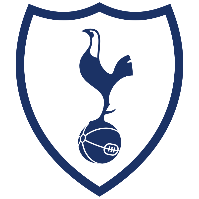
Tottenham Hotspur Logo 2006-Today
The Hotspur logo was redesigned again in 2006. The new version of the emblem is similar to the one used in 1973-1981. But it looks sleek and contemporary. The blue cockerel with a white head is standing on a blue football with white stitched. All contours are clean and smooth. When the wordmark is used, it is placed under the emblem, slightly arched. Its capitalized letters are executed in a simple yet bold and modern sans-serif typeface, which looks strong and stylish.

Tottenham Hotspur’s 25-man Champions League squad has been revealed

The Iconic Spurs Jersey: A Closer Look at Tottenham Hotspur’s Football Kit